Re-Imagining User Research
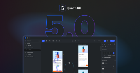
We understand the evolving landscape of user research, which is why we've spent the past year reimagining our platform from the ground up. We've carefully examined every aspect of the Quant-UX platform to identify areas for improvement. Our goal? To make user research more accessible, intuitive, and impactful for all professionals backgrounds.
A Fresh Look and Feel
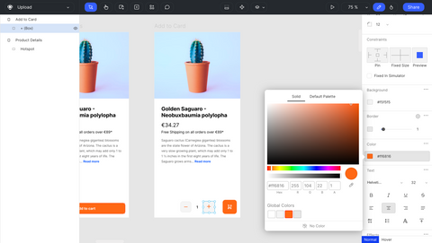
The most noticeable change in the enhanced Quant-UX experience is the polished design. We've gone back to the drawing board to reimagine both the Light and Dark themes, ensuring that each provides a visually pleasing and cohesive aesthetic that users will love. From subtle color palettes to refined typography, every detail has been meticulously crafted to create a more immersive and enjoyable user experience. Our enhancements focus on tightening the integration between design, test and analytics and making the platform easier to use. Here's a closer look at the key improvements:


Unified Canvas
Gone are the days of navigating between different pages to toggle between design and analytics views. We've unified the design and analytic canvas into one cohesive experience. Now, with a simple click on a switch in the top navigation bar, one can effortlessly switch between designing prototypes and analyzing user data, streamlining their workflow and saving valuable time.
Improved Analytics
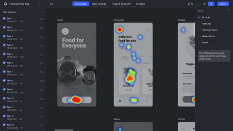
We've listened to user feedback and simplified the navigation in the analytic canvas. By reducing the number of top-level navigation elements from seven to four, we've made it easier for users to find what they need without unnecessary clutter. For example, mouse heatmaps are now integrated as a sub-mode in heatmaps, providing a more intuitive and efficient way to analyze user behavior. Additionally, the new canvas prominently displays the list of tests on the right side, allowing for more granular analysis by selecting heatmaps for individual users or subsets.
Project Management
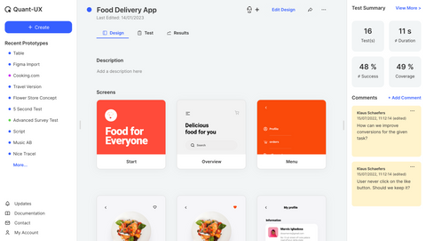
In addition to the canvas redesign, we've also rebuilt the project management functionality in Quant-UX from the ground up. Gone are the days of navigating from a general overview to a specific project; instead, Quant-UX now starts with a unified project page. This change not only allows for faster switching between projects but also emphasizes the importance of testing and collaboration through the introduction of the new right-hand sidebar.

Improved Collaboration and Note-Taking
Collaboration is key to successful user research, which is why we've enhanced collaboration and note-taking features in Quant-UX. Comments are now visible in the project management view and support threaded discussions, making it easier for teams to communicate and collaborate effectively.
AI Design Assistant
We've enhanced our AI Assistant to deliver faster and more accurate results while adhering closely to your design vision. The objective isn't to supplant the creative aspect of prototype creation, but rather to streamline and simplify repetitive tasks. For example, the assistant can kickstart form creation and position the appropriate widgets on the canvas, allowing you to refine the design and layout with greater ease and efficiency.
Streamlined Survey Creation
Creating qualitative surveys has never been easier with the introduction of a dedicated section on the component selector. Now, users can seamlessly integrate survey elements into their prototypes and automatically report user input during tests in the results tab. Additionally, new widgets like sortable lists make it even simpler to create sophisticated surveys that can be embedded in prototypes or shared as standalone surveys.
Bug Fixes and Smaller Improvements:
In addition to these major enhancements, we've also addressed numerous bugs and introduced many smaller improvements to enhance the productivty. For example, one can now easily change arrangements within a group or screen by pressing 'D' and utilizing the grid-alignment tool, improving efficiency and usability.