Mobile DropDowns Revisited
On mobile platforms, there are often better alternatives for dropdown menus. Luke Wroblewski wrote a fantastic article about the pros and cons of different controls and pointed out how many “taps” the user can save when using the appropriate elements. But saving taps is only one aspect when it comes to usability. Time is another crucial factor. You want to enable your users to complete their tasks as fast as possible.
To better understand how dropdown menus and their alternatives influence the time users take, I conducted my own experiments.
First Experiment:
In this experiment, the users were asked to fill out a search form of a flight app. They had to provide the following information:
- Departure Date (In the same month)
- Arrival Date (Two days after departure)
- Coach Category ( First Class )
- Number of passengers (6 Passengers)
I created two very different prototypes in Quant-UX.com, which resemble pretty much the examples illustrated in Luke’s article. The first prototype relies heavily on dropdowns, whereas the second prototype utilizes alternative controls like date range pickers, steppers and segment buttons. Just by changing the controls, one can reduce the minimal number of taps by a factor of three: from 28 to 9.
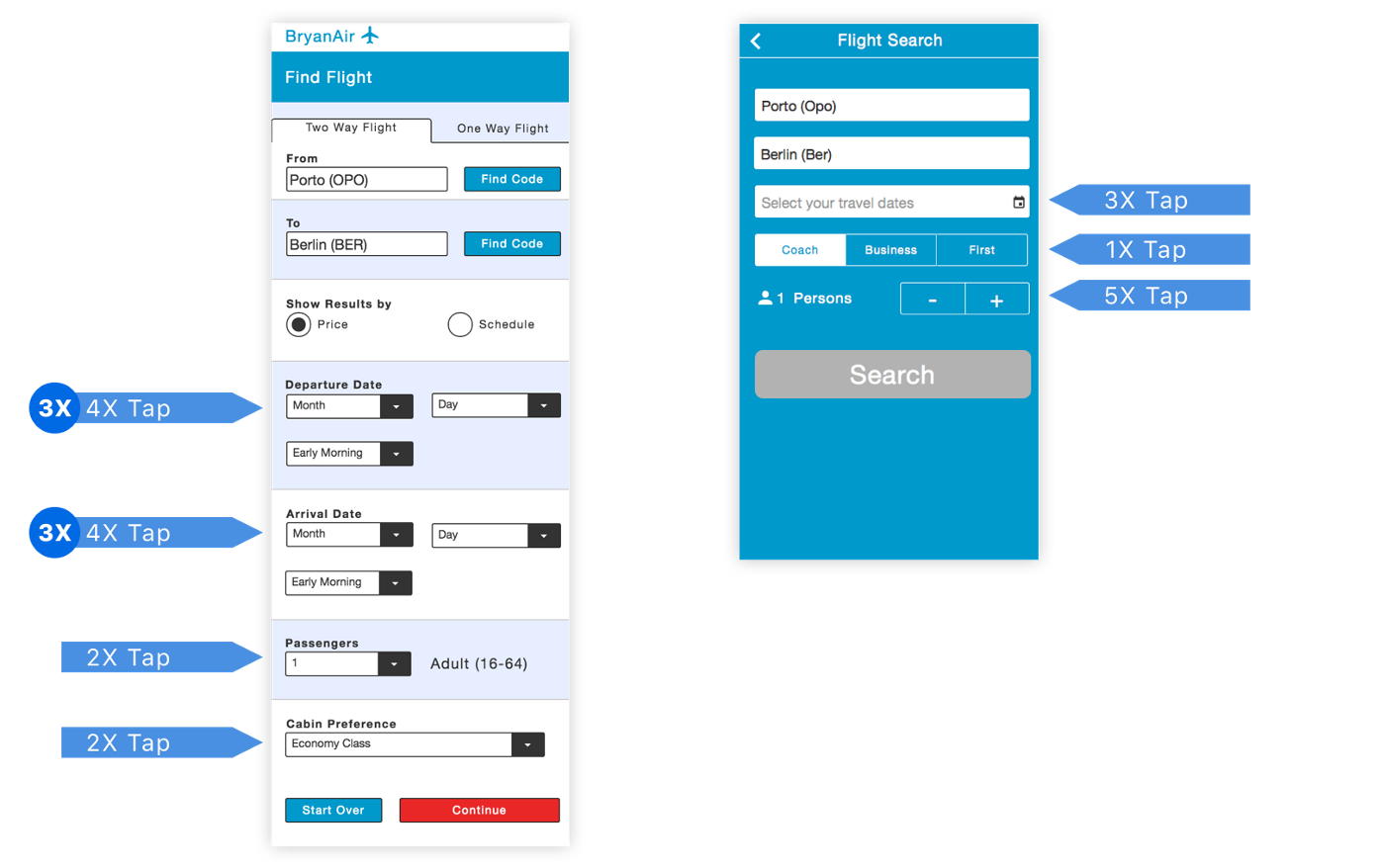 The two prototypes
Both designs were tested remotely. A link to the prototype and a short introduction was mailed to the testers, and they performed the tests on their smartphones. The age of the testers ranged from 25 to 45 years and all testers were experienced in using mobile apps. The first design was tested by 22 users and the second design by 47 users. For the sake of simplicity, the fields for the departure and destination airports were already filled out, so they could be ignored by the users.
The majority of the users managed to complete the test, but there is a significant difference in the execution times between both designs. The users of first design needed in average 43 seconds, whereas the users of the alternative version only took 25 seconds, which translates to an improvement of 40%.
“Avoiding dropdowns improves execution times by 40%”
The biggest contribution came clearly from the introduction of the single date range picker control, which replaces six dropdown menus. The users took only 8.5 seconds to enter arrival and departure date with the date range picker, in contrast to 22 seconds when using the six dropdowns.
Looking at the screen recordings (Example 1, Example 2), I saw that quite some users had issues using the date range picker. In an ideal case, the user would tap once to open the calendar, tap a second time to select a start date and use a third tap to select the end date and close the calendar.
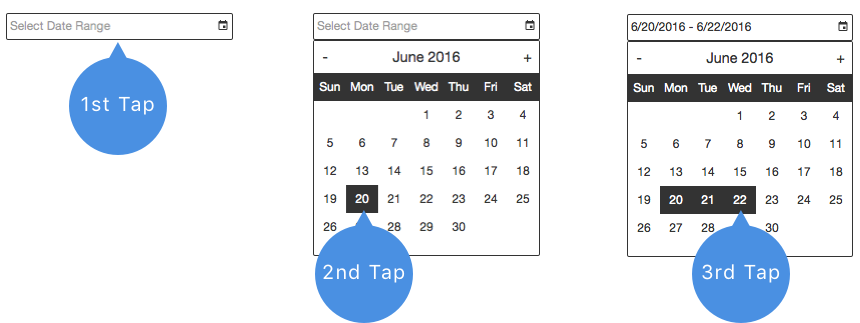 Three taps are required in best case to select a date range
However, a lot of users had issues with this interaction pattern. They were not expecting to tap a second time on the calendar. As a result, the users were not able to select the end date immediately, instead, they clicked another time on the start date, or closed the calendar, before trying again. Therefore, 50% of the users had to open the calendar a second time and 30% needed three or more attempts until the selected the correct date range.
“50% of the users had problems using the date range picker”
Second Experiment:
As a large fraction of the users was struggling with the date range picker, I decided to create a third prototype. I simply replaced the date range picker with two regular date pickers; one for the departure and one for the arrival. This design comes with the cost of one additional click and was tested by 27 remote users.
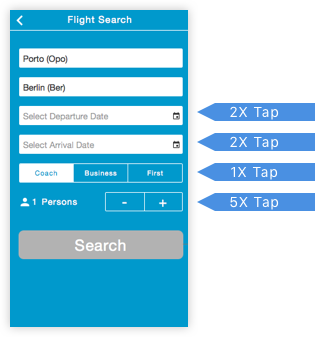 Less tabs by using the right widgets
The third prototype improved in two major aspects over the second version. First, all users managed to fill out the form, and no user had issues operating the two distinct date pickers.
“Using simple datepickers made the interaction 60% faster”
This lack of errors contributed to a reduction in execution time down to 16.5 second and made the users 60% faster when compared to the dropdown version.
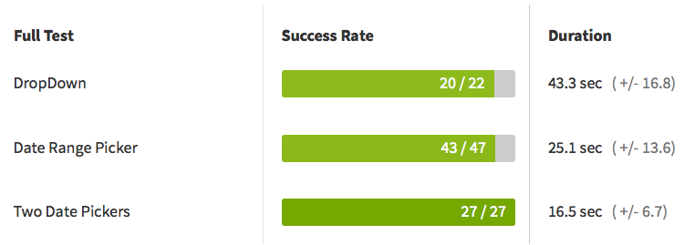 Two date pickers work best.
Other observations:
In my tests, the users were asked to search for a flight for six persons. This high number is for sure not usual, but I choose it to better understand how the stepper compares to a dropdown. In the dropdown menu, the users have to tap twice, once to popup the options, and once to select the correct number of passengers.
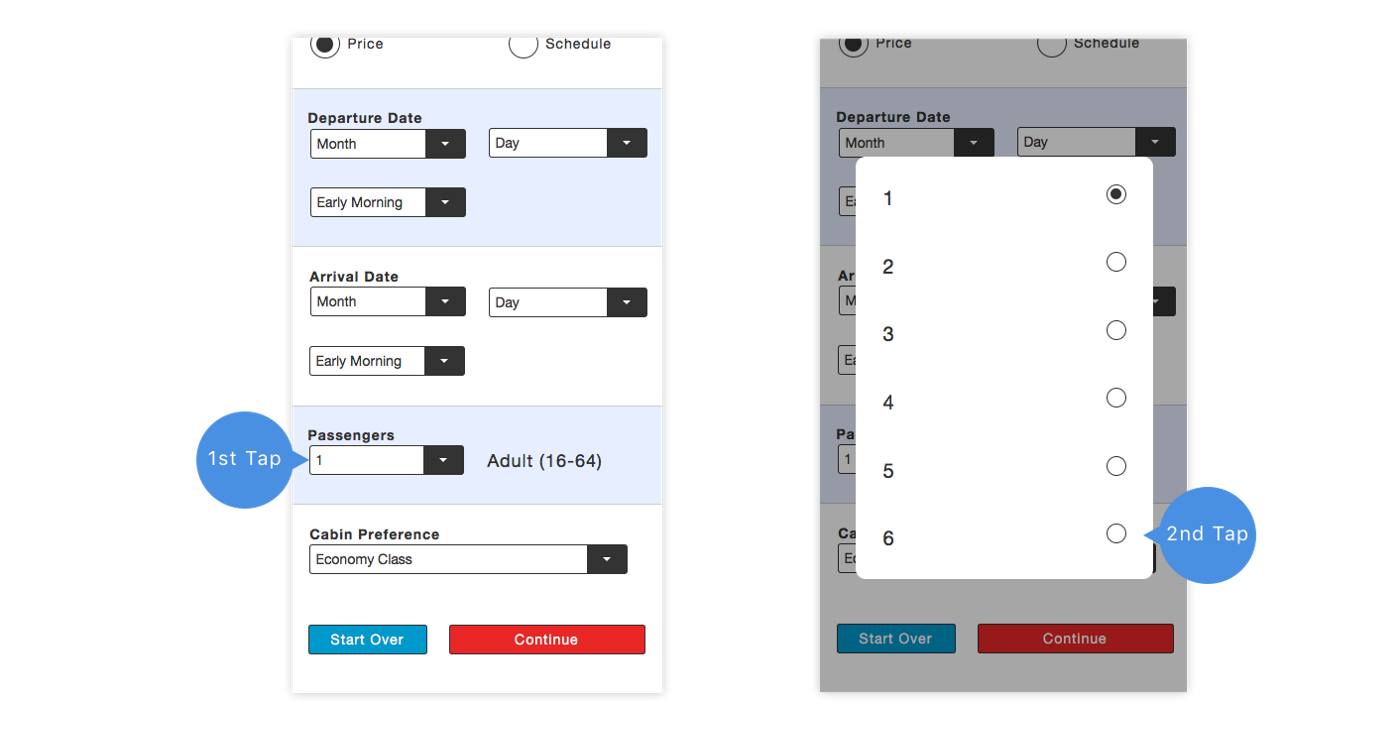 Two taps are required to select form a small set of options
The stepper requires 5 taps for the same selection. Introducing a widget that increases the number of taps seems counterproductive: don’t we want to make the interaction as smooth as possible? Fortunately, there is a big difference on how people interact with dropdown and stepper controls. The dropdown opens a new (modal) popup, which requires the users to scan the screen again to find the correct option, whereas the stepper does not change position. The user can simply continue clicking on the same spot. As a result, the users are only minimally slower when using the stepper widget to select six passengers.
 A stepper is slighlty slower for large numbers, but easier to use
In our tests, the users took in average 0.3 seconds per tap, only the last tap took a little longer, because the users don’t want to overstep. As a consequence, the stepper would be faster in scenarios with less than six persons. It is also noteworthy, that the stepper seems more intuitive, due to its higher success rate (77% vs. 88%).
I also replaced the dropdown menu for the coach selection with a segment control, which allows the user to select one of three choices. The segment button worked great, nearly all users (93%) managed to understand its function and select first class. The control not only saves two clicks, but also makes the users 1.5 seconds faster.
Conclusion
Avoiding dropdown menus is a crucial design pattern on mobile platforms. In my test, it made the users 60% faster and reduced usage errors. Date range pickers are powerful controls that can boost productivity, but are sometimes hard to use by novice users. Using two date pickers might, thus, be a safer choice. Segment controls are great for a small set of options. They are easy to use, and save screen estate when compared to alternatives like radio groups. Last, but not least, steppers work really well, in particular for smaller numbers. Although they require more clicks, they are extremely fast to use and therefore compensate the need for additional interactions.