Data Distribution
The data distribution gives you an overview of how much time the users spend in the prototype and how many clicks they took.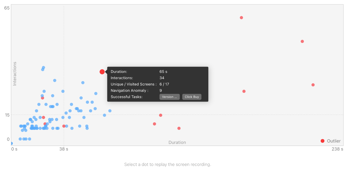
The scatter plot gives an instant overview of how the data is distributed. Often, most testers will use a similar amount of clicks and time. This will lead to a dense plot area where many of the circles are close together, which can be easily spotted. If this area is at a different place than you expected, the design might have some issues, or the task descriptions need to be more precise.
By clicking on a circle, one can open the session replay. Just click on the link that will appear below the chart.
Outliers
In statistics, outliers are data points very different from most of the data. Nevertheless, often it is interesting to investigate these data points because they reveal important insights.
In the scatter plot, outliers are marked red. These points present users have behaved differently than the majority of the users. For instance, they take more time, finish different tasks, or navigate unexpectedly. For the analysis, Quant-UX uses not only the interactions and the duration as inputs but also the following variables:
- Duration: The total time the user has spent on the test. A very high or low number might indicate that the user had issues.
- Interactions: The number of clicks and other interactions that the user has done.
- Unique Screens: The number of individual screens a user has seen. This metric quantifies if the user was able to navigate through the design.
- Total Screens: The total number of screens a user has visited. This number might differ from the number of visited screens, for instance, if users go back and forth between two screens. A significant difference might be a sign that the user had problems with the navigation.
- Navigation Anomaly: This metric measures how different a user's navigation patterns are compared to those of other users. For instance, if all users click 'button 1', 'button 2' and 'button 3' expect of one user that clicked 'button 3', 'button 2' and 'button 1', that last user would have a very high score (100) in this metric.
- Task Success: The number of tasks the user could complete.
Hovering over the points will open a tooltip with additional information to help understand why the user was an outlier. For a deeper analysis, click on the point and open the screen recording for an in-depth review.